
5 best practice tips for email marketing

If you aren’t optimizing your emails for conversion, you could be missing out on valuable clicks, sales, and ROI.
Reading this blog will provide you with five fundamental design best practice tips for high-performing email campaigns. You’ll also receive a handful of hints, tips, and useful tools to easily create email marketing campaigns that deliver great business results.
1. Above the fold
An adult’s attention span is on average about eight seconds. Not long, is it? With such a short attention span it’s safe to assume that not all of your recipients are reading your campaign word for word. Instead, they’ll scan through your email looking for something of interest which grabs their attention.
The fold is an important part of your campaign design and what’s above it has an impact on the performance of your emails.
What is the fold?
The fold is a term stemming from the world of printed newspapers and was the space of the newspaper cover that was visible after it was folded in half to be put out on display. It often contained breaking news headlines and content to draw immediate interest. Let’s bring that to the present day – ‘above the fold’ is the content that you can see instantly after opening an email campaign.
It should include content to attract the recipients’ attention and encourage them to scroll down the page. More importantly, it should include a call to action (CTA).
In email design, the ‘above the fold’ area is approximately 350 pixels high and 650 pixels wide.
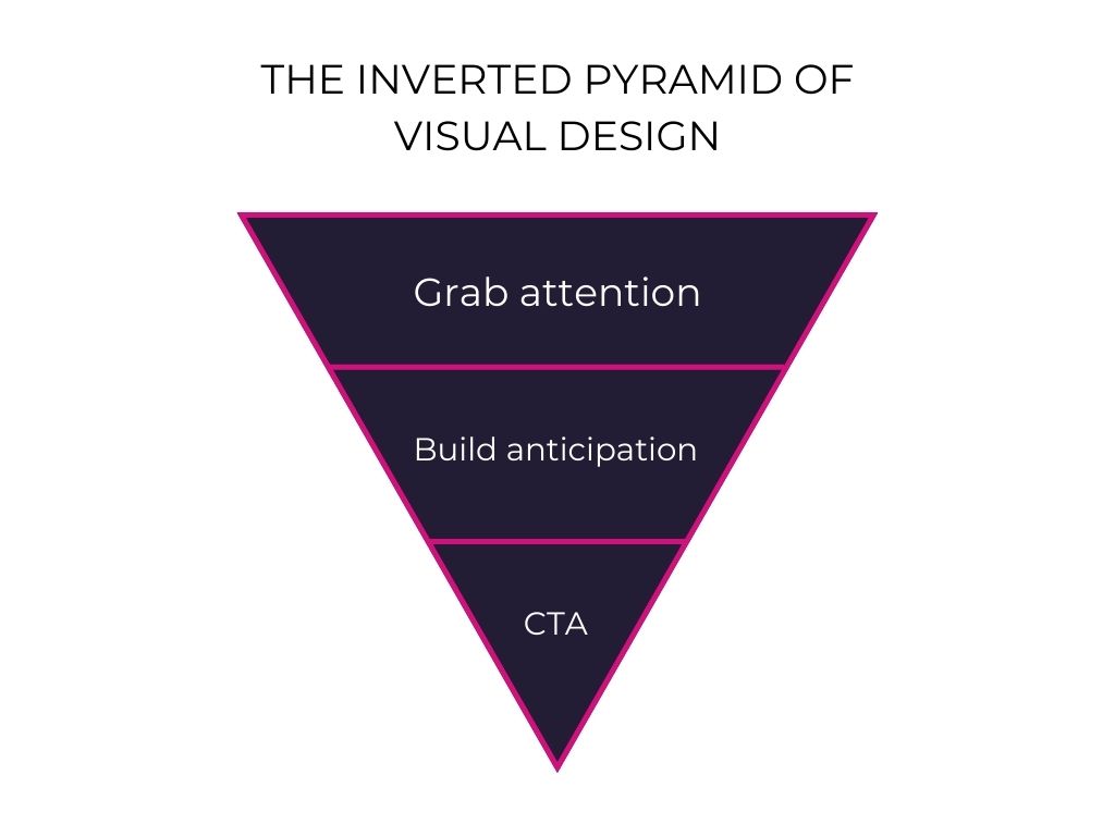
Have you heard of the inverted pyramid model? Combine this with key points for designing above the fold and you will create an effective way to ensure your recipients are taking the most away from your email campaigns in those crucial eight seconds.

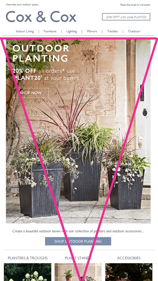
As you can see from the example below, email campaigns that follow the inverted pyramid model usually contain a concise headline that highlights the key message, a supporting CTA, and visuals to help convince readers of the benefits of clicking-through.
The inverted pyramid model works particularly well for campaigns with a single message and a single call to action, such as announcements and marketing offer campaigns.

2. Alt-text on images
We all know – and have probably experienced – that images can sometimes be blocked by default in email clients. How do we deal with this? Enter some alt text, of course!
Alt-text is the alternative text displayed with an image. It provides some context about what your image is for the recipients who have images blocked or turned off by default.
There’s another good reason for alt text, which often gets forgotten. Alt-text is used is for visually impaired subscribers that may use a screen reader to get a description of images in an email.
Tips for including alt text on images:
- Keep it succinct
- Include punctuation
- Include the text that is present in the image
- Don’t ‘copy and paste’ image captions. Your alt text should offer additional information that’s not conveyed through the caption.
- Keep the alt text in context
3. Responsive, mobile-first design
More email and web traffic are moving towards mobile and it’s likely that your recipients are reading your emails on a mobile device. Just by changing the styling and the methods applied to your mobile-first campaign, you could reach more potential or current users while multiplying your ROI.
Here’s a very quick checklist of what you should be implementing:
- Inline images
- Large and lovely CTAs
- Engaging content with nominal effort
We want to provide email campaigns full of content that is customized for your recipient’s device. Using dotdigital’s EasyEditor, you can use your responsive templates to send emails that adapt to fit the screen size and the device type they’re being viewed on.
Abide by these best practices to achieve effective responsive emails:
- Use a single-column layout. Less swiping and shifting makes it easier for your recipients to read your campaign.
- Use 12pt or 14pt font for the body text and no smaller than 18pt-20pt for the titles. This will ensure your campaign is much more readable on a small screen.
- Place your most important CTA above the fold.
- Avoid using hyperlinks – use a big, clickable button instead.
- Test, test, test. Use dotdigital’s ‘inbox and spam filter test’ which enables you to view your campaigns in all major email inboxes and receive a spam filter report.
4. Colors and fonts
There’s a high chance that your email campaigns aren’t the only interaction or communication your recipients will have with your brand. In fact, your recipients probably visited your website before signing up to receive campaigns from you.
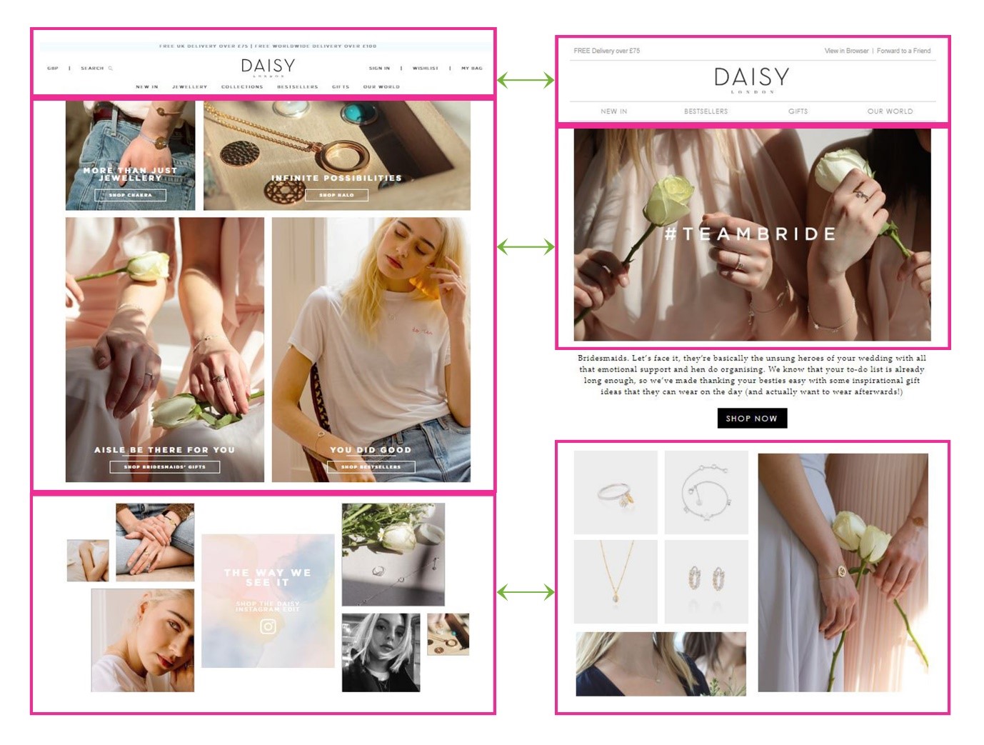
Because of this customer journey, it’s important that your email campaigns are aligned with the colors, fonts, and branding you use across your other channels.
It helps your customers to know that the email campaign is from you and it creates a level of trust and credibility which reassures people it’s safe to click through.
If you’re a dotdigital customer, this can be achieved with ease using our drag-and-drop EasyEditor. You can choose from a range of designer-selected, web-safe fonts and select your brand’s hex color. With these features, creating a high-converting email campaign that instills trust among your recipients is effortless.
Daisy London provides effective consistency between its website and its email campaigns. Take a look…

5. Preheader text
We’ve all heard that we should include one of these, but what exactly is it? It’s that little line of text that follows the subject line and introduces the content your recipient will find within the email campaign.
So many brands neglect the preheader, often leaving it blank or, rather shockingly, writing ‘dummy’ text, which consequently leads to poor results.
The crux of the preheader text is to serve as a courtesy to steer recipients in convincing them to open your email, boosting open rates and leading to higher ROI.
We’re in an age where our time is precious, and we seem to have less and less time. We scan and read rather than digest the words on a page. Plus, our attention span has dropped, so you might think that adding something extra to your campaign creation process will be pointless. But in fact, the preheader offers recipients a chance to get an idea using three text levels, helping them screen what is and is not relevant more quickly.
Conclusion
Email marketing is one of the most effective ways for marketers today to reach a wide audience base. But if you’re not optimizing your email campaigns for conversion, you could be missing out on valuable clicks, sales, and revenue for your business.
Next time you’re creating an email campaign, no matter the type of content or audience, apply these five email design fundamentals to get better results.
Contents
Jenna Paton, Content Marketing Manager
Jenna expertly writes thought-leadership content about cross-channel marketing and customer engagement and manages the creation and execution of Dotdigital's content marketing strategy.
Stay on top
Get the latest and greatest marketing insight delivered to you weekly
Your email address will be handled in accordance with our Privacy Policy. We gather data around email opens & clicks using standard technologies including clear gifs to help us monitor and improve our newsletter.


